Epic Life started as a blood test and grew into an AI health companion. We gave it a brand it could grow into: Your Health Home.
Website design & development
Verbal identity
Visual identity
Brand strategy & positioning
The receipts ↓
The Challenge
Epic Life started as a blood test. By the time we came in, it was becoming something much more interesting. An AI powered Health Companion. A persistent, personalised space where your health history, conditions, goals, and habits could live and compound over time.
The product had evolved - the brand hadn't.
They needed a complete repositioning: visual identity, and verbal system, built on a single strategic centre that everything else could be tested against. And that's what we delivered.
The observation.
Spend an hour with anyone trying to take their health seriously and the same picture forms. Blood results in one inbox. Wearable data across three apps. Symptoms half remembered at a GP appointment. Conditions scribbled in a notebook no one ever reads again.
The category was full of dashboards, one off tests, and clinical platforms. Plenty of data. Almost no continuity. Information without a home.
That gap was the opportunity.
Our Approach
The insight that unlocked everything.
Your health doesn't live in a one off test. It lives somewhere. And that somewhere should be yours.
The strategic centre we built the entire transformation on was the metaphor of home. Not as a decorative device. As a structural one.
A home is permanent. Personal. Safe. It gets more comfortable the longer you live in it. It holds your history without making you carry it. It is the opposite of a clinic.
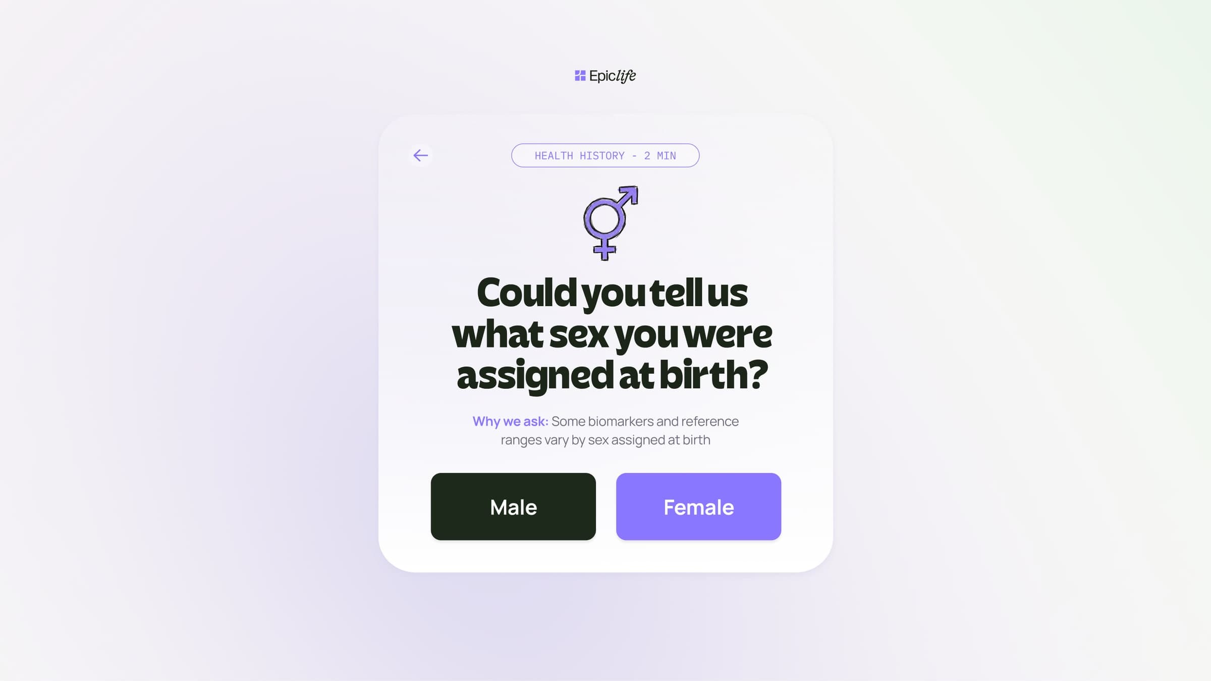
That shift, from product to place, from test to home, unlocked the positioning, the visual identity, the AI Companion persona, and the way onboarding asked its very first question.
OOB delivered a full brand transformation across three streams.
Strategy and messaging. A formal positioning statement. A competitive whitespace map showing exactly where Epic Life sits between cold clinical platforms and vague wellness apps. A headline truth, three non negotiable messaging pillars, and a page by page copy framework for homepage, product, pricing, and about pages. Working copy in every section, traceable back to a single idea.
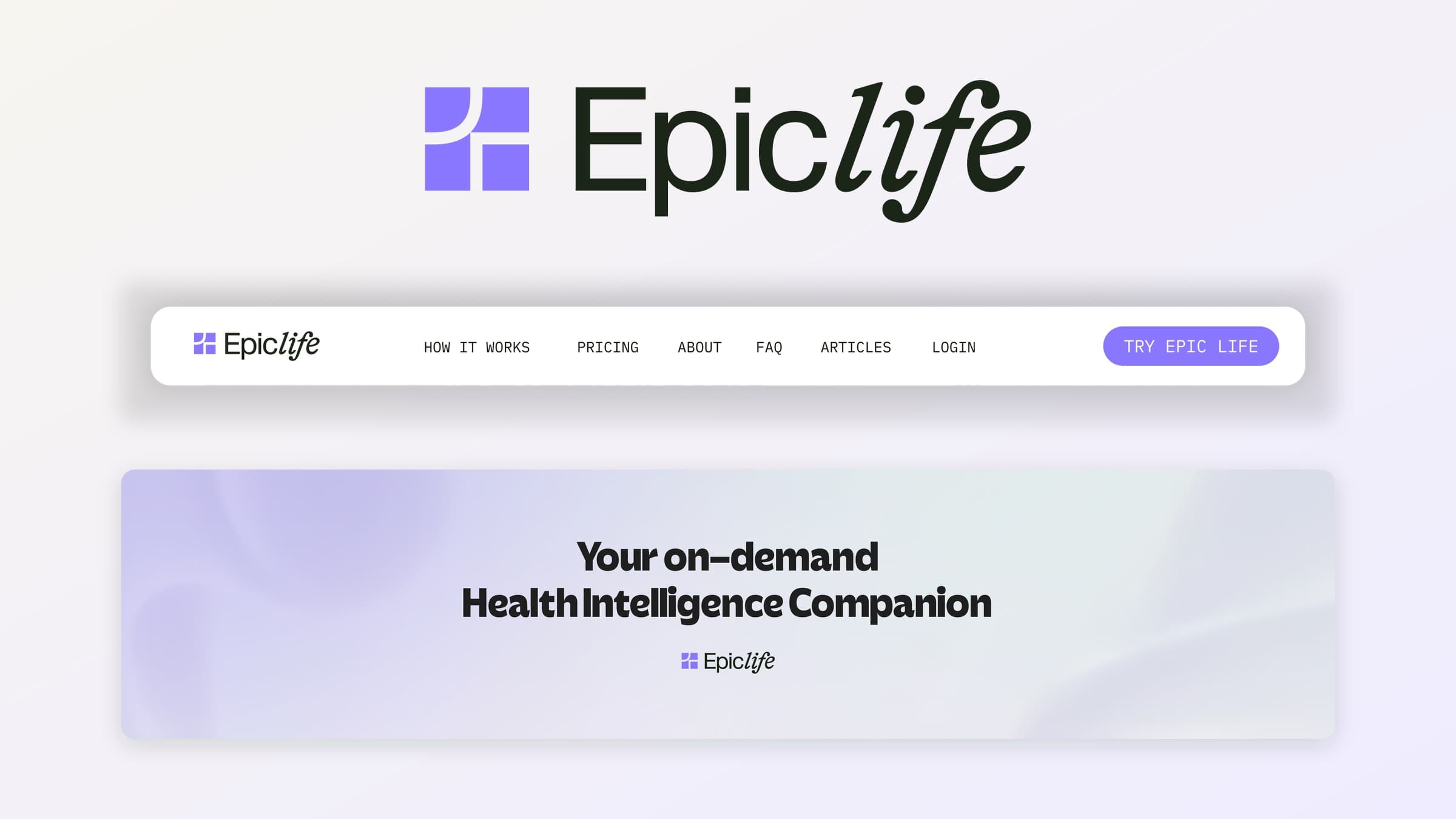
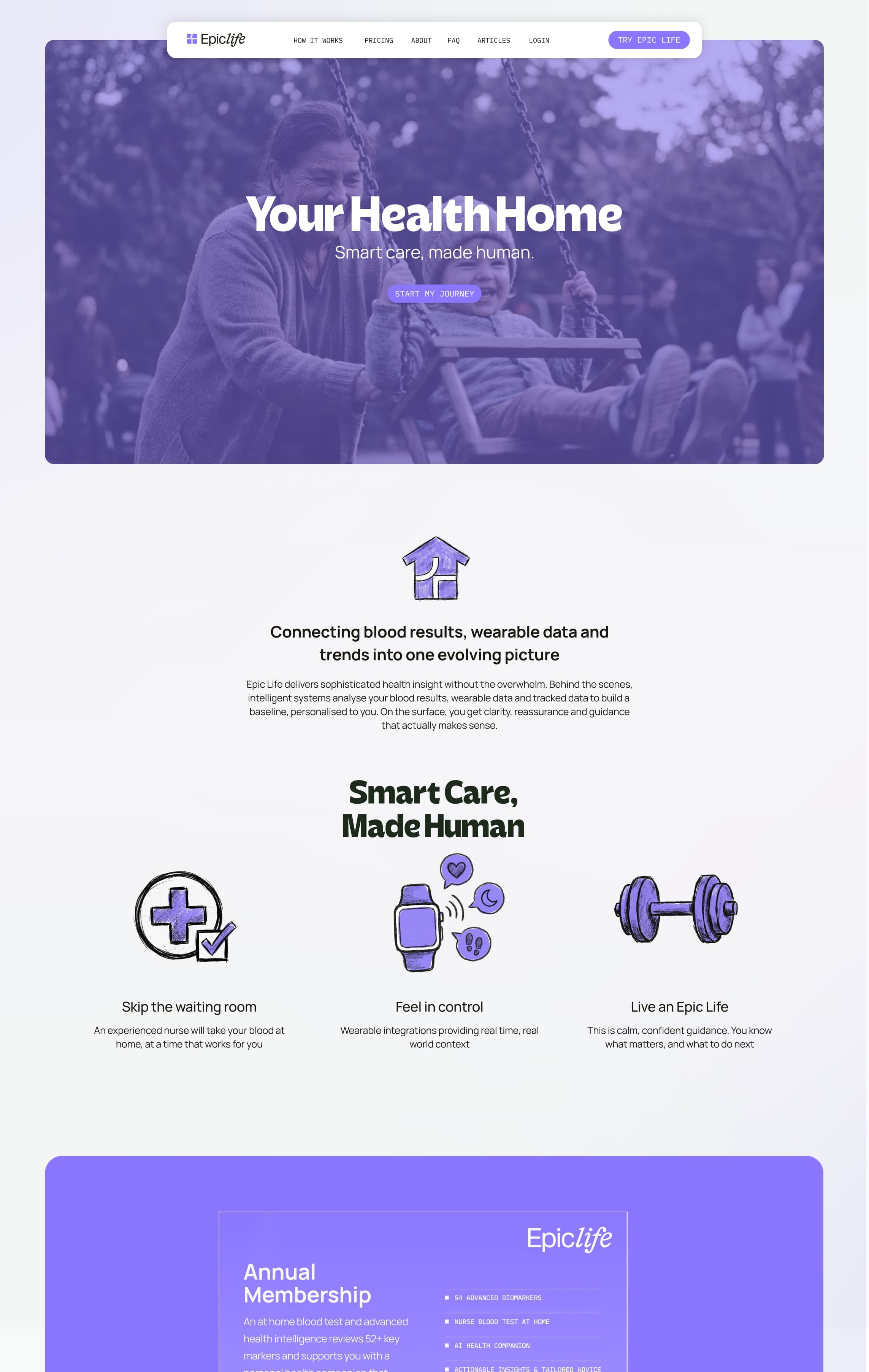
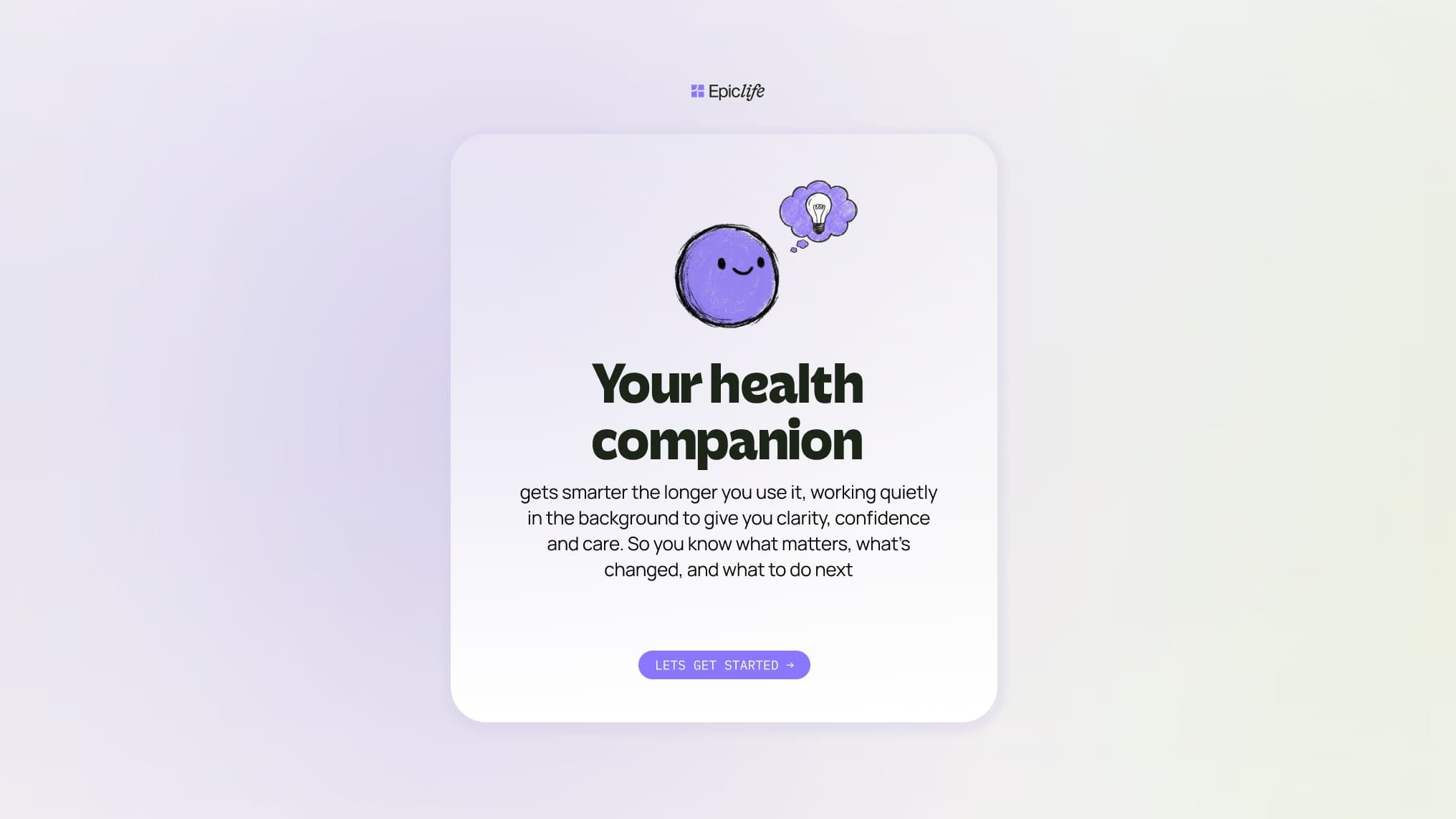
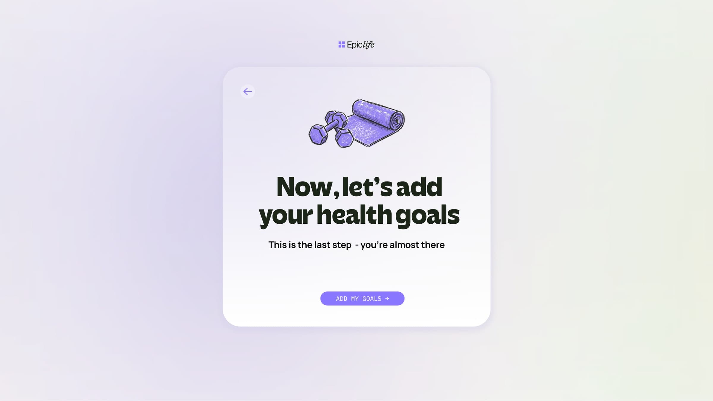
Visual identity. A new brand world built around Epic Life's existing purple palette: refined and extended into a warm, muted system designed to feel human rather than clinical. A new hero typeface (Seatren) paired with the existing Manrope. An illustration language using chalk-pencil texture, bold linework, and flat block colours, woven through with the Health Home metaphor, the AI Companion character, and the health domains the product covers. Website visual tests across multiple art direction routes.
epiclife.com
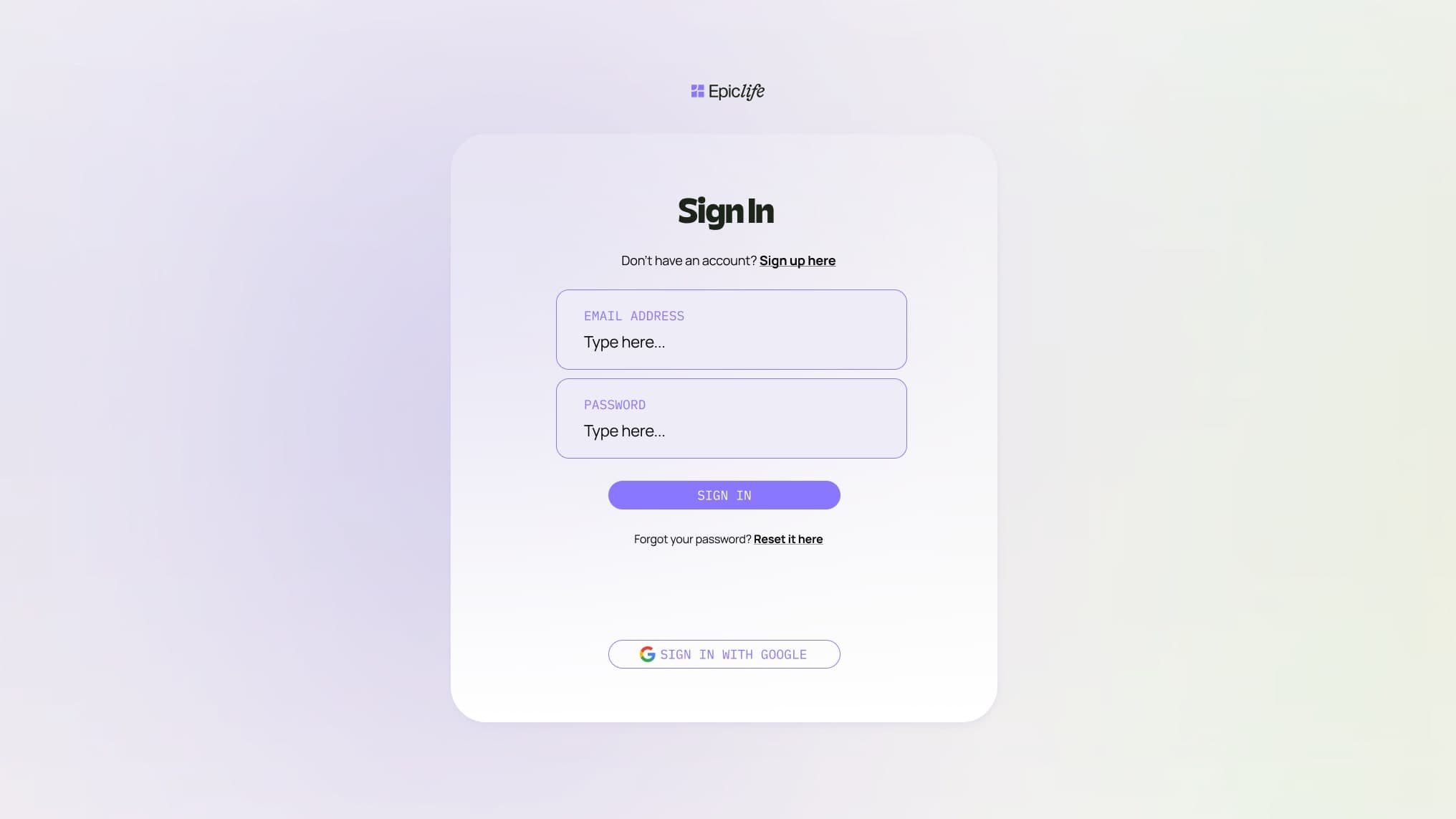
Verbal identity. A full tone of voice system with four principles and worked examples. A Health Companion persona covering voice, personality, expertise, and conversational boundaries. Onboarding tone rewrites turning cold clinical questions into warm, human ones. A Rooms creative framework giving the home metaphor real architectural depth. A headline bank, a banned words list with direct alternatives, and a phased launch direction.
app.epiclife.com/welcome
The shift in language.
Before
After
A health platform powered by biomarker testing
Your Health Home. Smart care, made human.
Track your biomarkers. Optimise your health.
Your health doesn't live in a one off test. It lives here.
AI-powered health insights
A companion who knows your history and speaks your language.
Tell us about your health
Let's start with what matters most to you.
Into the product.
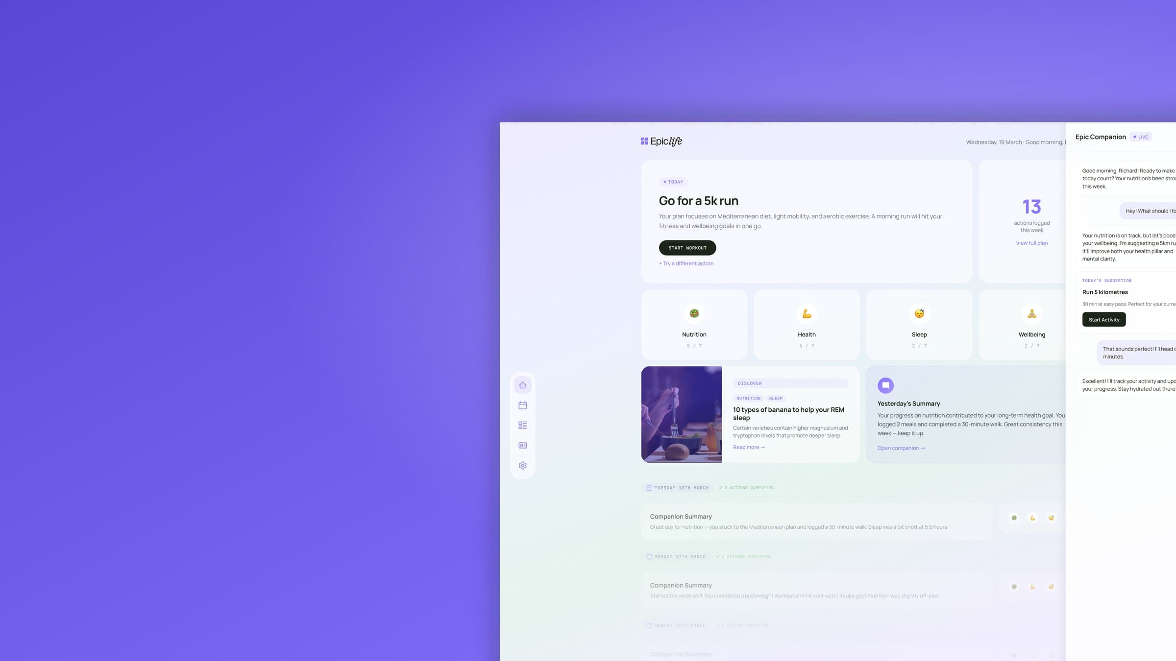
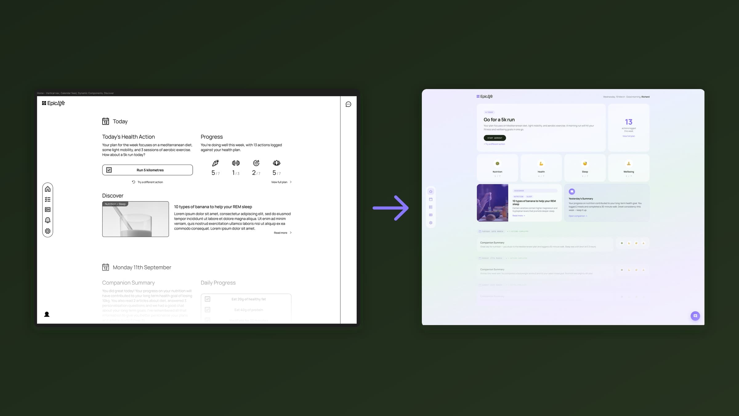
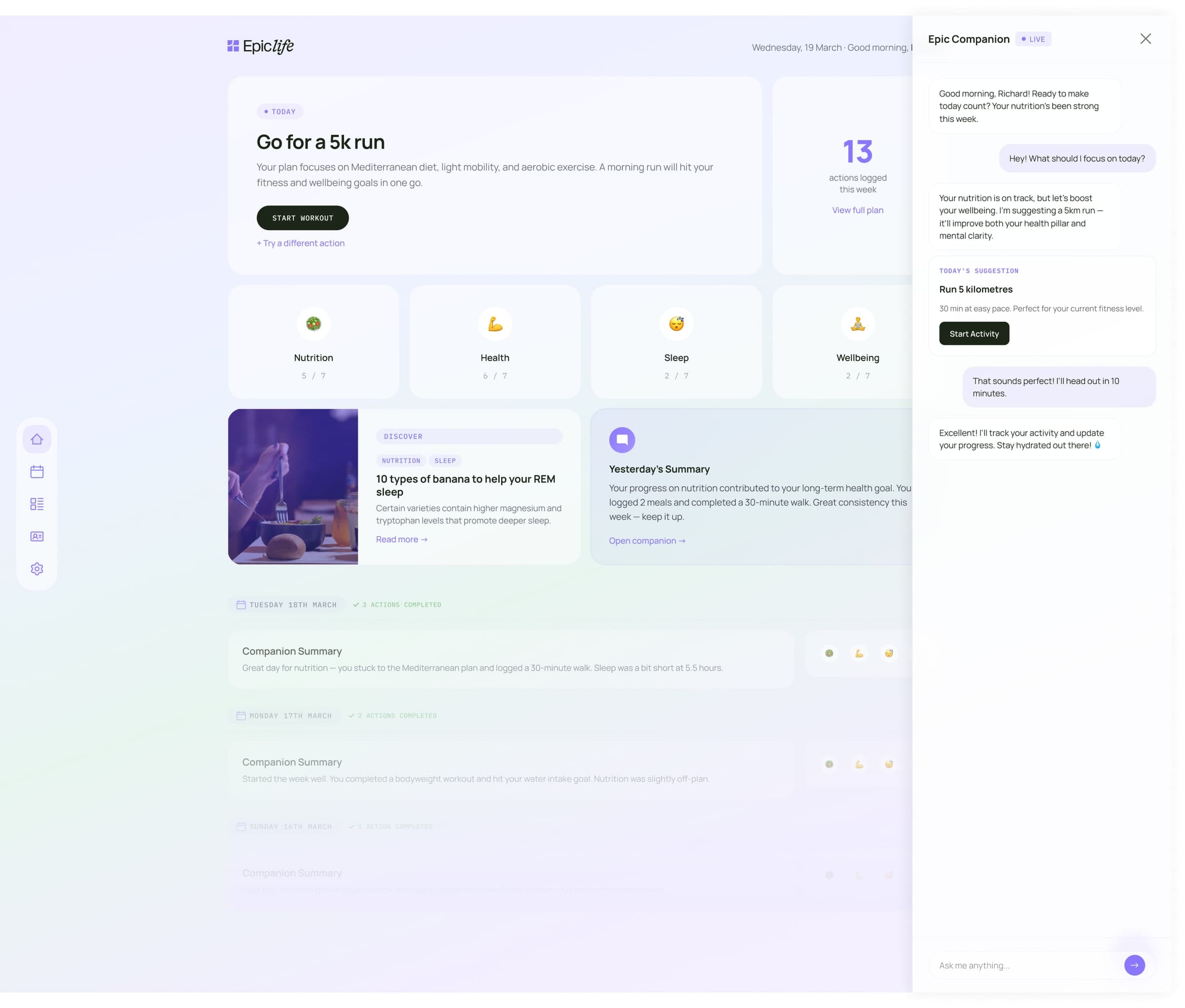
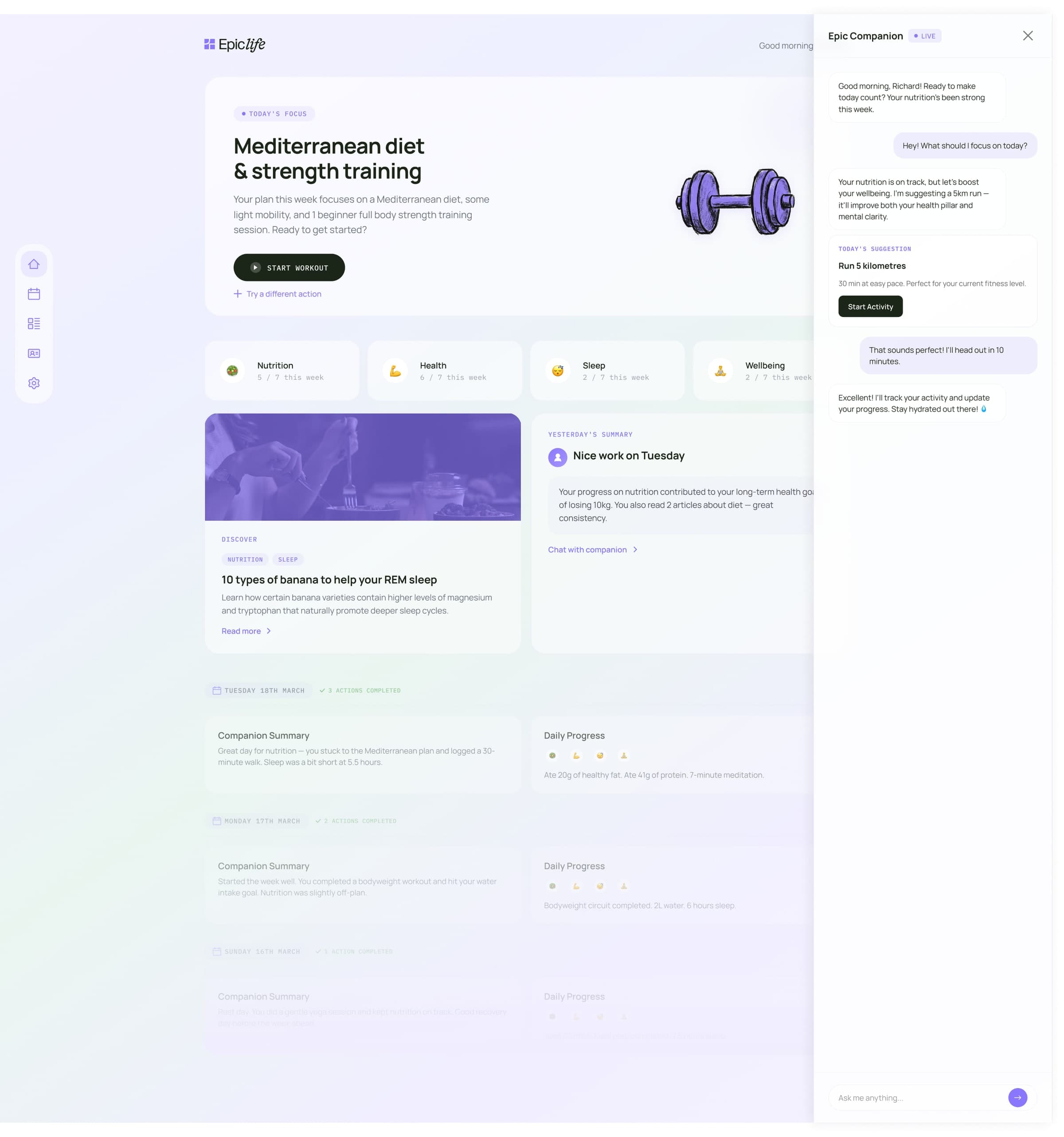
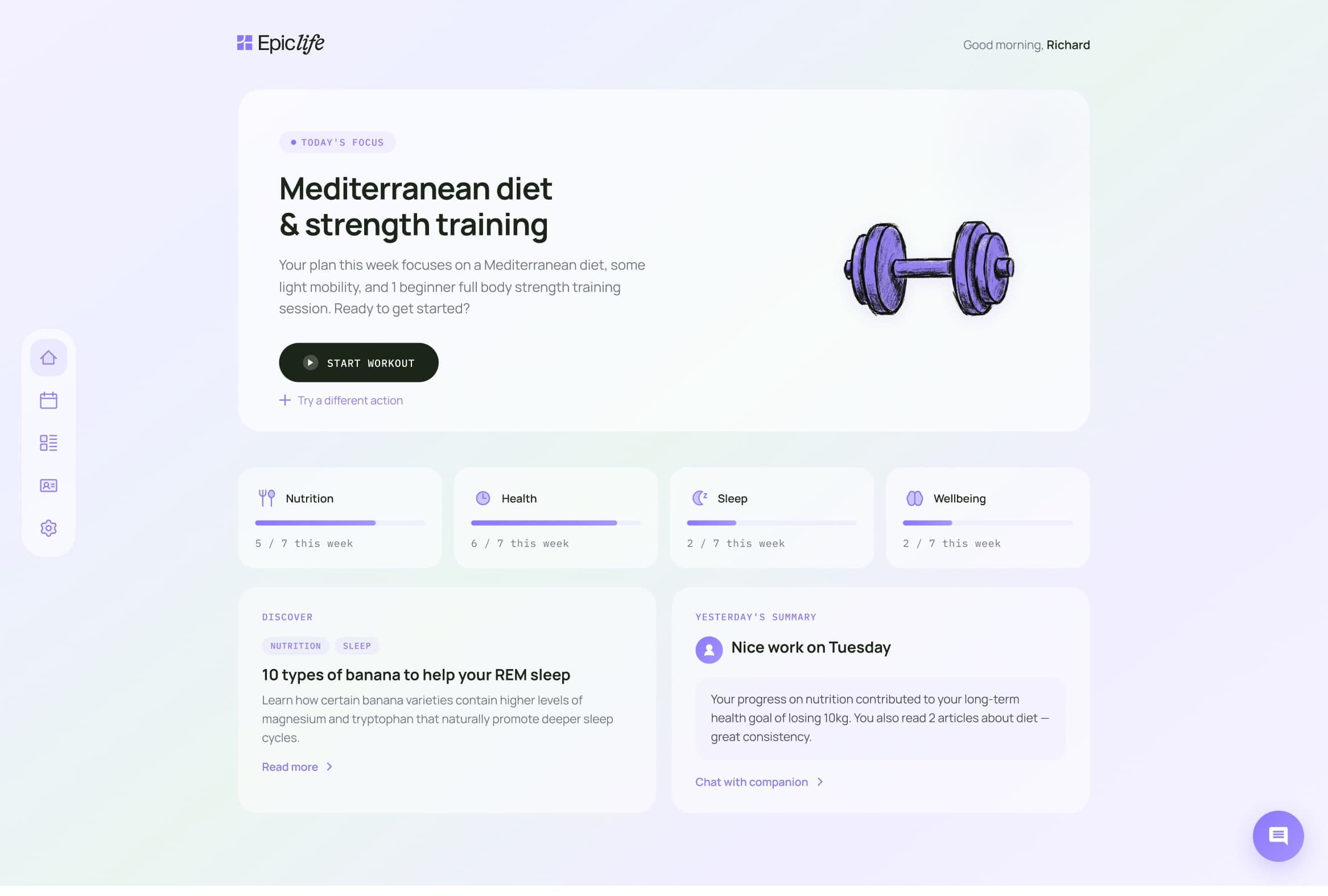
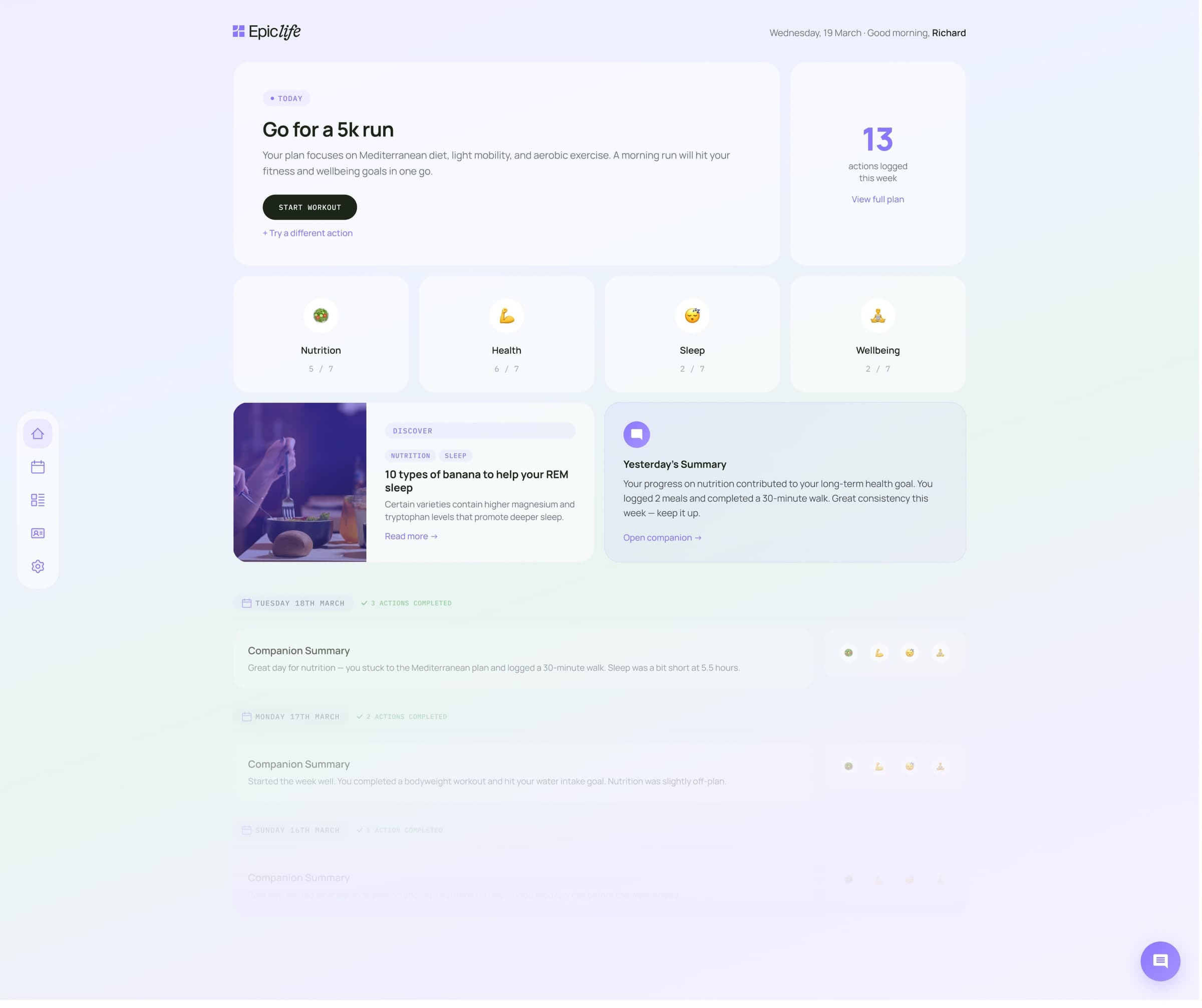
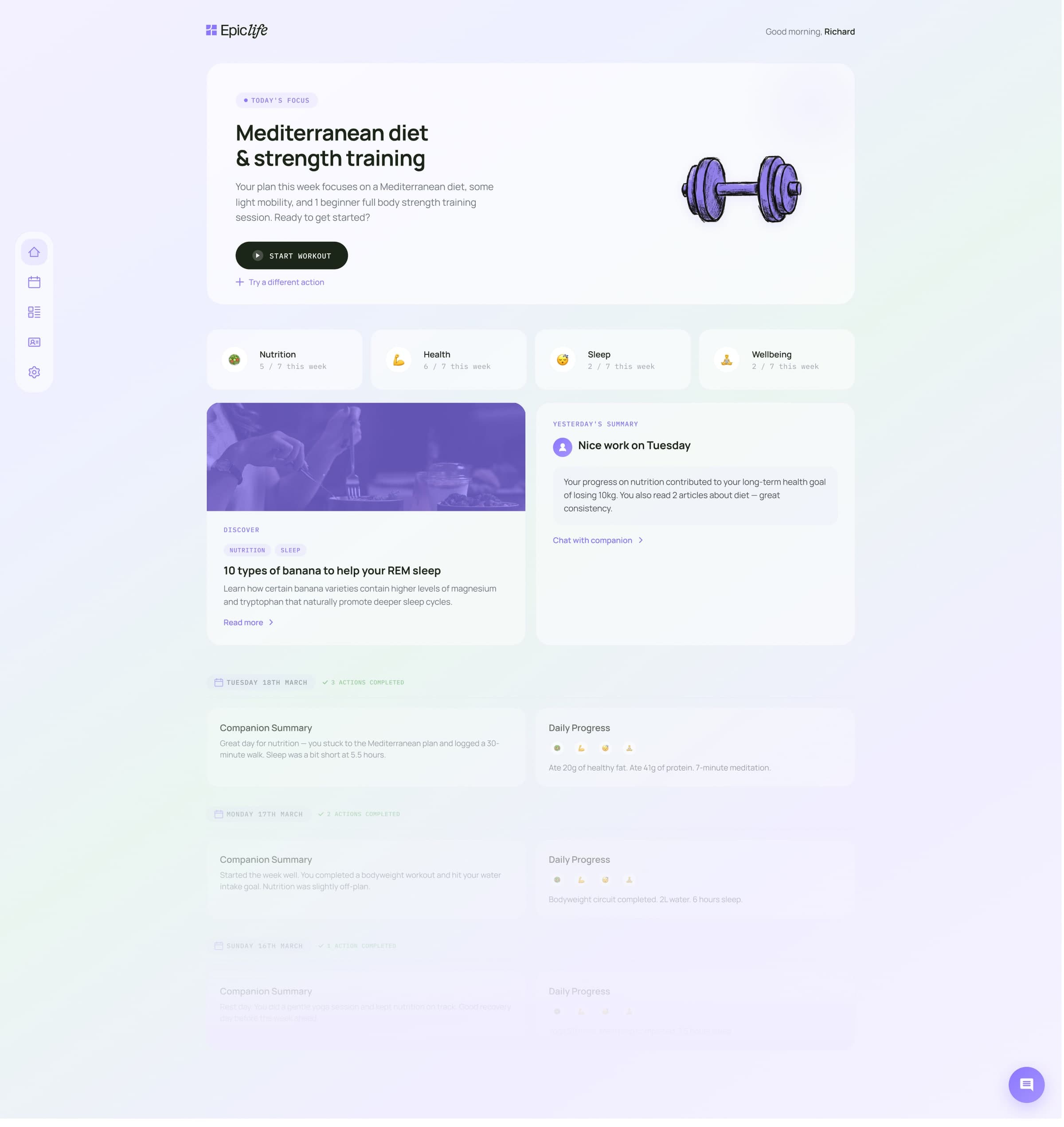
The Health Home had to work inside the app, not just on the homepage. So we took the product from wireframe to finished UI. A Today view built around one health action at a time. Progress across four pillars: nutrition, health, sleep and wellbeing. The Companion sitting in a chat panel right next to your plan, not buried in a menu. And a custom icon set drawn in the same chalk-pencil hand as the illustrations, so the product and the brand feel like they were made by the same people. Because they were.
app.epiclife.com/today
app.epiclife.com/focus
The Results
What it unlocked.
A brand the product can grow into. The Health Home idea is durable. It holds whether Epic Life is a blood test today, a wearable integration tomorrow, or a fully integrated AI health platform in two years. It doesn't need to be rewritten every time a new feature ships.
The team now has a positioning statement that survives roadmap changes. A messaging architecture built for scale. A visual and verbal identity that's warm, credible, and differentiated in a category that defaults to cold. A social content system ready to deploy. And a live website that made it real.
app.epiclife.com/progress
🖌️Visual identityA look that's impossible to scroll pastRead more →